

UX importance in e-Commerce

Mădălina Stănescu – fondatoare Optimized · ex‑Google · expert PPC.
Categories
Article overview
We live in an era where 77% of internet users in Romania have ordered or purchased goods or services online, according to the National Institute of Statistics. In such a vast and competitive ocean, where consumer attention is a finite and precious resource, what makes the difference between a simple e-commerce website and a platform that not only sells but also captivates, builds loyalty, and turns visitors into brand-loyal customers? I have tried to answer all these questions as concisely as possible in this article.
What is UX?
User Experience, or UX for short, represents the entirety of reactions and perceptions a user has when interacting with a site. It's not limited to just the visual aspect or technical functionality but extends to the entire user journey: from the first contact with the site, perhaps through a Google search or a social media ad, to navigating categories, discovering products, the process of adding to cart, completing the order, and even post-purchase interactions (tracking delivery, requesting support, the return process). The impact of well-thought-out UX is massive. Studies show that UX can increase conversion rates by up to 400% (Forrester Research), and every dollar invested in UX can generate a return of up to $100 (Forrester Research). An eloquent example is Staples, which increased its revenue by 500% after UX optimization (Staples Case study).
How do we know if a site has good UX?
Well-designed UX is, essentially, invisible. The user shouldn't have to think about how the site works; everything should feel easy to use, natural, and fluid. When a potential customer lands on your site, they should immediately feel oriented, not overwhelmed or confused.
Which criteria do we follow?
This starts with a well-thought-out structure where product categories are logical, names are clear and intuitive, and the path to the desired product is as direct as possible. Usually, when we check a website for UX, we analyze the following in turn: homepage, search bar, category page, product page, shopping cart, and finally, the checkout page. Here we check criteria such as: how quickly the site loads, whether the search bar has autocomplete and autosuggest functions, if product images are high quality, etc. Navigation menus must be easily accessible, regardless of the page the user is on. This clarity is essential because, according to Think With Google, 61% of users leave a site if they don't quickly find the information they are looking for. Once the user reaches a product page, it's not enough for the product to be good; the customer needs to understand why it's good and if it meets their specific needs.
Product Page
This is where detailed and well-written descriptions, complete technical specifications, high-quality images from multiple angles, and ideally, demonstrative videos come into play. Moreover, easy access to reviews from other buyers, Q&A sections, or accurate size guides significantly contributes to reducing reluctance and building the trust needed to add the product to the cart. Effective UX organizes all this information in a readable and easy-to-scan manner, without cluttering the page.

(As we can see, this product page ticks several best practice criteria, including: an add-to-cart button in a different color from the rest of the site's colors, high-quality product images, display of stock availability and delivery time, display of ratings, display of similar product recommendations, cross-sell and up-sell areas, etc.)
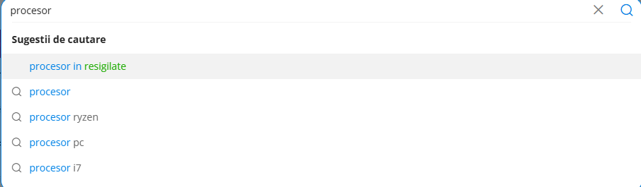
Search Bar
Furthermore, the search function plays a crucial role. According to a study by Nosto, 69% of consumers go directly to the search bar when visiting an online store. A high-performance search bar that offers relevant suggestions as the user types, understands synonyms or minor typos, and allows advanced filtering of results by specific criteria (price, size, brand, popularity) can make the difference between converting a customer or not.
Speed and Mobile Optimization
Another fundamental aspect of modern UX is performance, especially on mobile devices. Loading speed is critical: 53% of users abandon a mobile site if the page doesn't load in 3 seconds (Google / Think With Google). Moreover, 74% of users are more likely to return to a mobile-optimized site, and 67% are more willing to buy from mobile-friendly sites (Google / Mobile UX Research, cited in Think With Google). Therefore, a fluid and fast mobile experience is no longer a luxury but a necessity.
Error 404 - what to do?
Also, how errors are managed is very important – for example, when a search yields no results. Stores should encourage dialogue with the user, offering helpful tools to keep them on the site (contact information, products similar to what the user searched for, best sellers, recommendations on how to search better, a link to the homepage, a sitemap, etc.).
The Checkout Process
The most important moment in any online transaction is, undoubtedly, the checkout process. This is the point where many potential customers abandon, not due to lack of interest in the product, but because of an overly complicated and frustrating journey. The statistics are telling: according to the Baymard Institute, the average shopping cart abandonment rate is approximately 70%. The main reasons cited for this abandonment include unexpected costs (48%), the need to create an account (24%), and a checkout process that is too long or complicated (22%) (Baymard Institute). The good news is that an optimized checkout can increase conversions by approximately 35% (Baymard Institute). Optimizing UX at this stage is extremely important. This involves:
- simplifying the process to the minimum necessary steps, requesting only absolutely necessary information
- offering a "guest checkout" option for those who do not wish to create an account.
- transparency of costs is another crucial aspect; delivery fees and any other additional costs must be displayed clearly and early, not as an unpleasant surprise at the end.
- visual progress indicators, which show the user what stage they are at and how much further they have to go, contribute to a sense of control.
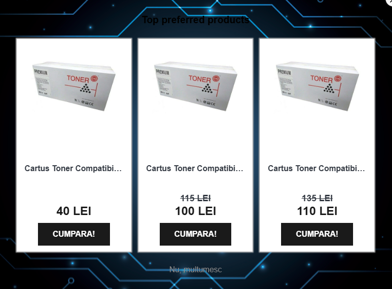
(an example of what NOT to do! The checkout process should not be interrupted by intrusive pop-ups as these can annoy the user and lead to lost conversions)
Orders have started to come in - now what?
However, we must not forget that the user experience doesn't end with placing the order. Post-purchase interactions are just as important for consolidating a positive relationship and encouraging loyalty. Neglecting this stage can have serious consequences: a PwC study shows that 32% of users abandon a brand after a single negative experience. Moreover, 88% of users do not return to a site with poor UX (UXCam.com, summary from multiple studies). On the other hand, a positive experience is rewarded: 80% of customers are willing to pay more for a better experience (PwC). UX that is attentive to this phase ensures prompt and clear communication regarding the order status, from confirmation to dispatch and delivery. The ability to track the parcel in real-time, a simple and transparent return process without hassle, and accessible and empathetic customer support contribute enormously to the overall perception of the brand. These details, though they may seem insignificant, demonstrate respect for the customer and reinforce the confidence that they made the right choice.
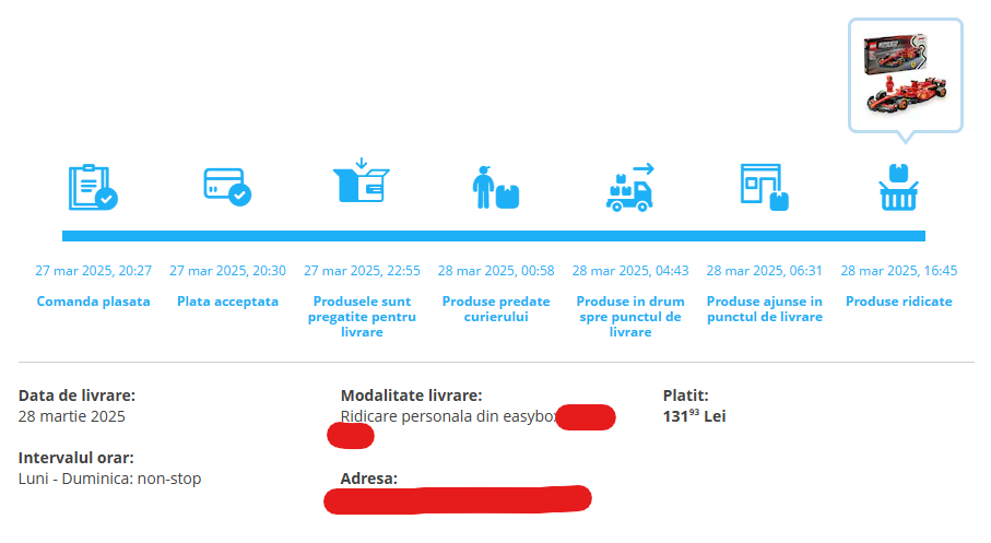
(example of clear and detailed communication of order status)
Now that you have successfully gone through this article, we hope you have a better understanding of why well-built UX is crucial for the success of an e-commerce site. If you still have more questions, don't hesitate to contact us! Good luck with conversions!
About Optimized
Our team consists of experts in Performance Marketing, especially in eCommerce. Every day, we gather information and strive to learn more about our clients and their needs. We operate on the principle of anticipating results and the growth of a business, for their success and ours. Together.


